Reusable Table Components in Motif/X11
by Jeremy Bischoff, Software Engineer
While Motif is well suited for the needs of our law firm portal (see the introduction to the portal here), anyone who works with the toolkit quickly discovers a particular gap: it has no built-in table widget. You can create labels, push buttons, row column containers, and separators, but there is nothing that behaves like the structured tables that are intuitive to read and easy for users to understand. Many Motif applications simply avoid tables altogether. Others try to approximate them with ad hoc combinations of horizontal and vertical boxes, fixed pixel adjustments, or deeply nested containers. These approaches generally do work, but they are fragile and repetitive, and they make it difficult to maintain a consistent interface and style across an entire application.
Our law firm portal relies heavily on structured data. Staff hours, billing entries, task lists, case activity, and operational metrics are all easiest to understand in table form. Tables were a natural fit for the data we needed to display, and building each one individually would have added complexity and reduced consistency. We needed something better: a reliable, reusable table component built directly from Motif's primitives but designed to behave like the kind of tables modern users expect.
That was the motivation behind building a custom table system for the portal. Instead of forcing tables into Motif's widget limitations, we created a set of functions and patterns that let us construct consistent and adaptable tables anywhere in the application, tailored to our specifications.
Motif's limitations as an advantage
Motif does not impose any opinionated structure for tables. This initially looks like a drawback, but it ultimately becomes a strength. The toolkit provides primitive widgets such as XmLabel, XmPushButton, and XmSeparator, as well as composite widgets like XmRowColumn and XmForm, but none of these define a table structure on their own. Because there is no default table widget, we are able to control every aspect of how tables look and behave: alignment, spacing, separators, column widths, and color rules. The result is a design that is clean, predictable, and straightforward to develop and maintain.
This allows tables in the portal to share the same structure and spacing whether they list payments, matters, staff, or tasks. Headers line up as expected. Separators appear in the same places. Action buttons follow the same layout in each row. Even our color coded precedence column (Routine, Priority, Urgent) also appears consistently wherever it is used. This uniformity comes from defining the table structure in a single component rather than rebuilding it each time.
How the component is structured
Our reusable table system is built entirely from Motif's fundamental building blocks. These include xmLabelWidgetClass (Label) for static text cells, xmPushButtonWidgetClass (Push Button) for interactive cells, xmRowColumnWidgetClass (RowColumn) for horizontal and vertical grouping, and xmSeparatorWidgetClass (Separator) for grid boundaries. By combining these primitives with well-defined attachment rules on a parent xmFormWidgetClass (Form), we can construct table layouts that behave consistently across every panel of the application.
Our table component is comprised of three parts:
1. A header row constructed from Labels and vertical Separators
The header is a horizontal RowColumn container (RowColumn set to XmHORIZONTAL) that holds one Label widget per column. Each Label has a fixed width so that all rows align. Single-pixel Separator widgets (XmVERTICAL) are inserted between columns to give the header a visual grid structure.
2. A body container that holds dynamically constructed rows
The table body is another RowColumn container, this time with vertical orientation. Each row inside the body is itself a horizontal RowColumn that follows the same pattern: fixed-width Label widgets for text cells, optional PushButton widgets for action cells, and vertical Separator widgets to maintain alignment. The body can grow or shrink without affecting the surrounding layout.
3. Top and bottom horizontal Separators to frame the table
A horizontal Separator is placed immediately under the header, giving the separation expected in a structured table. Another horizontal Separator sits beneath the body and provides a consistent visual boundary, especially when tables appear alongside other widgets such as graphs or form inputs.
All of these components live inside a parent Form widget. The Form allows us to attach the header to an existing widget above it, attach the body to the header, and anchor the bottom separator to the Form's lower edge. The result is a self-contained table unit that positions itself cleanly within any surrounding layout.
The table component is represented by a compact C structure that holds the main panel, header, body, and separator widgets used by the system.
/* Structure representing a complete reusable table unit */
typedef struct GenericTable {
    Widget panel;        /* main panel container */
    Widget header;       /* header row widget */
    Widget body;         /* body container for data rows */
    Widget header_sep;   /* horizontal separator under header */
    Widget bottom_sep;   /* horizontal separator after last row */
} GenericTable;

Below is the core function that assembles these elements into a complete table unit:
GenericTable create_table(Widget parent, Widget top_widget, Widget header_row, const char *body_name) {
    GenericTable table = {0};

    /* Position header row */
    XtVaSetValues(header_row,
                  XmNtopAttachment, XmATTACH_WIDGET,
                  XmNtopWidget, top_widget,
                  XmNleftAttachment, XmATTACH_FORM,
                  XmNrightAttachment, XmATTACH_FORM,
                  NULL);
    table.header = header_row;

    /* Always create horizontal separator under header */
    table.header_sep = create_separator(parent, XmHORIZONTAL);
    XtVaSetValues(table.header_sep,
                  XmNtopAttachment, XmATTACH_WIDGET,
                  XmNtopWidget, header_row,
                  XmNleftAttachment, XmATTACH_FORM,
                  XmNrightAttachment, XmATTACH_FORM,
                  NULL);
    Widget attach_widget = table.header_sep;

    /* Create body container */
    table.body = XmCreateRowColumn(parent, (char*)body_name, NULL, 0);
    XtVaSetValues(table.body,
                  XmNorientation, XmVERTICAL,
                  XmNpacking, XmPACK_TIGHT,
                  XmNtopAttachment, XmATTACH_WIDGET,
                  XmNtopWidget, attach_widget,
                  XmNleftAttachment, XmATTACH_FORM,
                  XmNrightAttachment, XmATTACH_FORM,
                  XmNbottomAttachment, XmATTACH_NONE,
                  NULL);
    XtManageChild(table.body);

    /* Always add bottom separator after the body container */
    table.bottom_sep = create_separator(parent, XmHORIZONTAL);
    XtVaSetValues(table.bottom_sep,
                  XmNtopAttachment, XmATTACH_WIDGET,
                  XmNtopWidget, table.body,
                  XmNleftAttachment, XmATTACH_FORM,
                  XmNrightAttachment, XmATTACH_FORM,
                  XmNbottomAttachment, XmATTACH_FORM,
                  NULL);

    return table;
}
Hierarchy structure:
Form
 |-- Header (RowColumn HORIZONTAL)
 |    |--- Label
 |    |--- Separator (VERTICAL)
 |    |--- Label ...
 |--- Separator (HORIZONTAL)
 |--- Body (RowColumn VERTICAL)
 |    |--- Row (RowColumn HORIZONTAL)
 |    |     |--- Label
 |    |     |--- Separator
 |    |     |--- Label ...
 |    |--- Row ...
 |--- Separator (HORIZONTAL)
Column definitions are based on three parallel arrays. The first array specifies the fixed pixel width for each cell so that columns remain aligned across every row. The second array defines alignment rules and maps directly to Motif's built-in values such as XmALIGNMENT_BEGINNING, XmALIGNMENT_CENTER, and XmALIGNMENT_END. The third array contains the visible text for each cell, either as header labels or row content. With these three inputs, the component constructs the row automatically. The system interprets the arrays, places vertical separators between columns, and creates the appropriate Motif widgets with no additional layout work required from the developer.
The core logic for a simple row appears below:
/* Generic table row creation */
Widget create_table_row(Widget parent, const char *row_name, const char *texts[], const int widths[], const unsigned char alignments[], int column_count) {
    Widget row = XmCreateRowColumn(parent, (char*)row_name, NULL, 0);
    XtVaSetValues(row, XmNorientation, XmHORIZONTAL, XmNpacking, XmPACK_TIGHT, NULL);
    XtManageChild(row);

    for (int i = 0; i < column_count; i++) {
        if (i > 0) {
            (void)create_separator(row, XmVERTICAL);
        }
        (void)create_label_with_width(row, texts[i] ? texts[i] : "", alignments[i], widths[i]);
    }
    return row;
}
This function creates a horizontal RowColumn container for the row, adds a vertical separator before every column except the first, and then inserts a label of the specified width and alignment. Because each column is generated from the same rule set, new rows remain visually consistent regardless of their content.
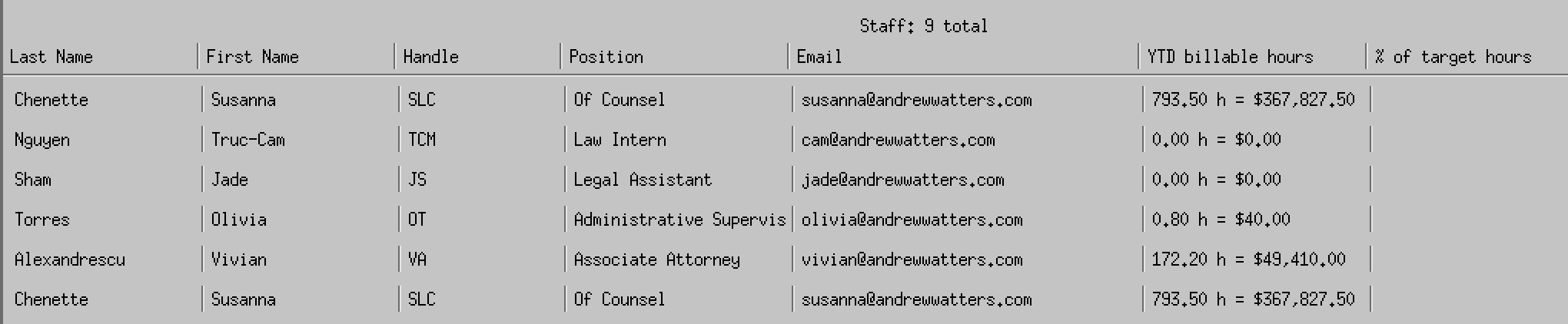
Concrete usage example - the following snippet shows how a real panel in the portal creates a Users table using the reusable table component:
/* Example: Users table column definitions */
static const int COL_WIDTHS[7] = { 120, 120, 100, 140, 220, 140, 140 };
static const unsigned char COL_ALIGNMENTS[7] = {
    XmALIGNMENT_BEGINNING, XmALIGNMENT_BEGINNING, XmALIGNMENT_BEGINNING,
    XmALIGNMENT_BEGINNING, XmALIGNMENT_BEGINNING, XmALIGNMENT_END,
    XmALIGNMENT_END
};

/* Create header row */
static Widget create_header_row(Widget parent) {
    const char *texts[7] = {
        "Last Name", "First Name", "Handle", "Position",
        "Email", "YTD billable hours", "% of target hours"
    };
    return create_table_row(parent, "usersHeader", texts,
                           COL_WIDTHS, COL_ALIGNMENTS, 7);
}

/* Usage in panel creation */
Widget header_row = create_header_row(panel);
GenericTable table = create_table(panel, top_widget, header_row, "usersBody");
/* table.body now holds all data rows */
Extending rows with actions and color rules
Some tables require more than static text cells. The same row construction pattern supports embedded widgets, such as pairs of action buttons in the final column, or columns that use color coding to convey status. In our task table, for example, the precedence column highlights Routine, Priority, and Urgent using cached X11 color allocations. These features build on the same fixed-width structure and do not require any changes to the table component itself.
Simplifying layout across the application
The table component is built to integrate cleanly into any screen of the portal. Several helper functions manage widget positioning, whether that involves fixed coordinates, attachment to edges, or alignment with other widgets. Because all tables follow the same construction rules, adding new panels to the portal is straightforward. A developer defines a header, chooses column widths, provides the data, and calls the table functions. The rest is handled automatically.
This consistency improves maintainability. A single change to spacing or alignment affects every table in the portal. If we update the appearance of separators or the structure of action columns, every table benefits immediately.
Why this matters for the portal
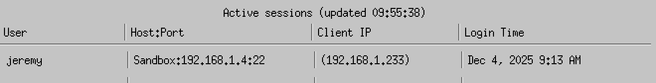
The table component has already been used for many sections of the application: staff listings, billing summaries, active tasks, hottest cases, server activity, and document logs. Each table is visually consistent with the others, even though they display very different kinds of data.
More importantly, development speed improves significantly. Adding a new table now takes minutes instead of hours. There is no need to hand tune pixel offsets or rebuild separator logic. The component provides the structure and the developer provides the data.
This approach fits the overall philosophy of the X11 portal: a fast and focused interface built from simple components that do exactly what the firm needs. By using Motif's primitives rather than relying on heavyweight UI frameworks, we keep the system predictable and lean while still maintaining modern expectations for usability and clarity.
Adapting the Component for Other Motif Applications
Although this table system was designed for the specific needs of our law firm portal, the approach is not tied to the portal itself. Because the component is built entirely from standard Motif primitives and layout rules, developers can use the same ideas in any Motif application and adapt them to their own requirements.
Motif does not prescribe how a table should look or behave, so the structure shown here is only one possible design. Some applications may want sortable headers, different spacing, alternative color rules, or embedded widgets inside cells. Others may choose a simpler layout with fewer separators. Since the component is constructed from XmForm, XmRowColumn, Label, PushButton, and Separator widgets, each part can be modified or replaced without affecting the overall pattern.
The important idea is not the exact structure used in the portal, but the method: treat a table as a composable unit built from predictable primitives, define column rules once, and generate rows and headers through reusable functions. This pattern can be carried into any Motif project, regardless of the type of data it presents.
By starting with a clear layout strategy and adapting it as needed, developers avoid the fragmentation and repetitive layout code that often accumulate in Motif interfaces. The same principles support long-term maintainability whether the table displays staff lists, sensor data, logs, or dashboards.
Closing thoughts
The table system is a small example of what makes the X11 portal effective: start with simple Motif primitives, define clear patterns, and build components that can be reused across the application. This approach keeps the interface consistent, reduces development effort, and gives us full control over how information is presented. As the portal grows, the same principles will continue to guide new features and keep the system reliable and easy to maintain.
